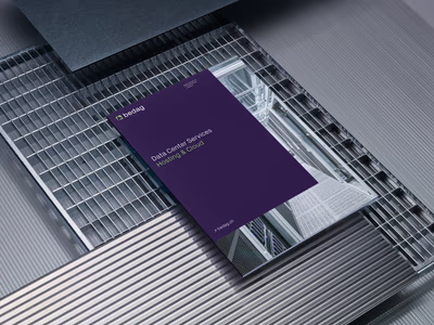
Bedag Informatik AG
The digital heartbeat of bern
Year
July 2022
Industry
Energy / Tech / Industry
Context
The core business of Bern-based Bedag lies in the development, maintenance, and operation of IT solutions. In redesigning its visual identity, Bedag wanted to retain its technical affinity while appearing modern and consistent.
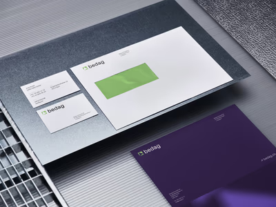
The new appearance reflects Bedag’s innovative character and focuses on clear, coherent communication. The overhaul relies on a distinct color and form language, fresh typography, and a comprehensive modernization of branding elements.
Services
Links
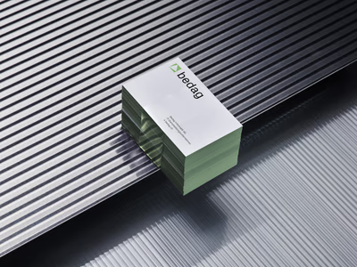
The distinctive triangle unites commitment, integrity, and professionalism.
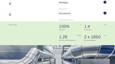
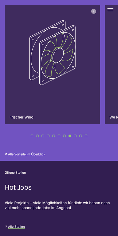
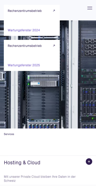
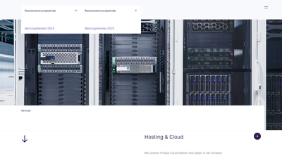
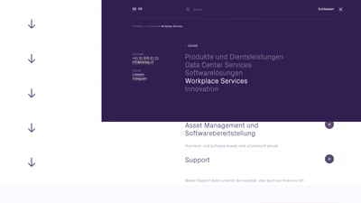
The centerpiece of the new identity is the redesigned website, which addresses both Bedag’s competencies and its clients’ needs.
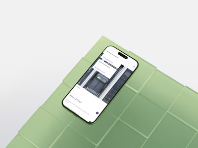
Clear, organized, precise – the visual world relies on reduced compositions, authentic motifs, and a modern, objective aesthetic – on equal footing.

Clean lines, technical colors, and a calm visual style convey competence and reliability.
The key visual is based on the three pillars: commitment, integrity, and professionalism. Clear lines and minimal forms provide stability, modernity, and focus – a precise, powerful symbol of identity.
In animation, it unfolds its full radiance, bringing dynamism to the visual identity.
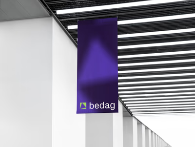
Numerous products have already been created in collaboration, all consistently uniting the branding parameters. Each element carries the brand’s clear signature, combining precision, modernity, and consistency into a coherent overall image.
