Energie Buchsi
Certainty that it works consistently.
Year
April 2025
Industry
Energy / Tech / Industry

Context
Energie Münchenbuchsee AG is sharpening its identity – and moving closer to the people of Buchsi. “EMAG” becomes “Energie Buchsi”: a name that shows where you come from, what you stand for, and where you’re headed. Locally rooted, reliable in everyday life, and ready for the future.
It all begins with a strategic repositioning. Reliability, proximity to the community, and a forward-looking perspective form the foundation. The major task: not just to articulate this mindset, but to make it visible. Strategy becomes design – clear, distinctive, and truly connected to Buchsi.
Services
Links
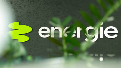
The new logo of Energie Buchsi combines the flow of constant energy with a subtle reference to boxwood leaves. It represents continuous supply, local rootedness, and progress.
Energie Buchsi acts out of conviction – Buchsi-rooted, reliable, and indispensable for the people of Münchenbuchsee.
The new Energie Buchsi brand comes to life through clear core elements. Logo, colors, typography, and imagery reflect the positioning and form an identity that makes reliability, closeness, and progress tangible on all levels.
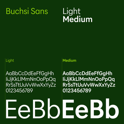
Die Schrift Buchsi Sans verleiht dem Markenauftritt Klarheit und Charakter. Im Logo greift sie die Formsprache der Bildmarke auf, im Lauftext sorgt ihre schmalere Variante für gute Lesbarkeit und eine ruhige Anmutung.

The color palette of Energie Buchsi is based on harmoniously coordinated shades of green that combine naturalness and progress. A deep, powerful green gives the brand substance and elegance, while a radiant, fresh green serves as an energetic accent, creating vibrancy and a sense of new beginnings.
Complementing the visual world, the portraits show the people of Energie Buchsi in a personal moment. Authentic and unpretentious, they embody what defines Energie Buchsi: reliability, commitment, and closeness to the community.


Complementing the visual world, the portraits show the people of Energie Buchsi in a personal moment. Authentic and unpretentious, they embody what defines Energie Buchsi: reliability, commitment, and closeness to the community.


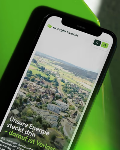
The website conveys the character of Energie Buchsi clearly and directly. Design and content digitally showcase the brand’s values.
EMAG becomes Energie Buchsi
Energie Buchsi stands for a brand that builds trust and actively helps shape the future of the community. The new identity combines consistency with a spirit of renewal – in a clear, contemporary language.
The visual identity captures this mindset precisely: with an authentic visual world, a distinctive typography, and a harmonious color palette. Close to the people, strong in expression, and reliable in its promise.