Movetia
Exchange and mobility
Year
January 2016
Industry
Public / NPO

Background
“Movetia” is the national agency for exchange and mobility – founded in 2017 and supported by the federal government and the cantons. We’ve been working with Movetia since 2016, starting with a solid foundation of brand strategy and naming.
Movetia was established with the vision that every young person should participate in at least one exchange. Together with commonsense, we developed the brand core. Based on this, we created all brand elements.
Services
“Movetia” combines “Move” for movement and “vetia” as a nod to Helvetia. The italicized spelling of the first four letters emphasizes the dynamic component.
Bunte Farben und lebendige Bilder stehen für kulturellen Austausch und jugendliche Begeisterung, während klare, serifenlose Schriften eine direkte und zugängliche Kommunikation ermöglichen.
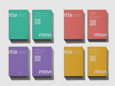
All employees were able to choose their individual business card color from the Movetia color palette.
Ein prägendes Markenelement des Erscheinungsbildes sind die Icons. Ihre klare Gestaltung und intuitive Symbolik machen sie unverwechselbar.
Für Movetia entstanden vielseitige Anwendungen – von Print über Messeauftritte bis digital, massgeschneidert zur Stärkung der Marke und Optimierung der Kommunikation.


The annual calendar compiles all important events and helps Movetia coordinate its activities in a targeted manner.
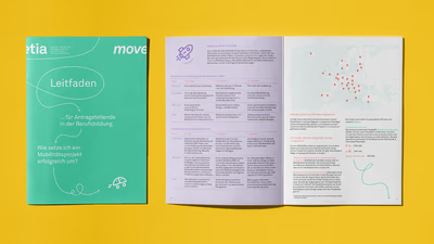

The decision tree makes program selection easy and playful. Icons provide clarity, helping users quickly find the best option.
