BFU
Prevention with foresight
Year
January 2020
Industry
Public / NPO
Initial Situation
BFU makes people safe. As a competence centre, it conducts research and provides advice to reduce serious accidents in Switzerland – in road traffic, at home, during leisure activities, and in sports.
To better reflect its status as a competence centre for accident prevention, BFU is updating its brand identity. The new visual appearance communicates simply, visionarily, and across all of Switzerland.
Services
Links
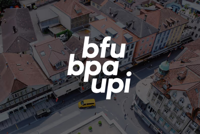
In addition to the formal simplification to a logo version valid for all national languages, BFU conveys the cohesion of the language regions.
In the new logo, the three names are united across languages and collectively. Aligned with the position of the language regions on the Swiss map, the three names are arranged above one another.

Like a seal of quality, they make BFU recognizable as a memorable wordmark.


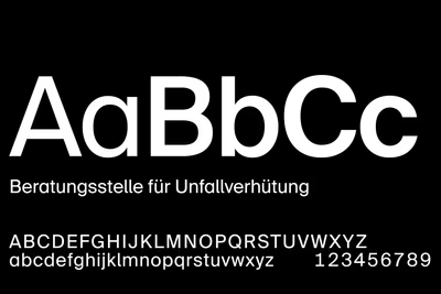
The corporate typeface “BFU Suisse” gives BFU’s positioning a distinctive typographic identity. Inspired by the logo, it combines elegance, strength, and confidence in a clear typeface.
The custom typeface “BFU Suisse” strengthens recognition across all media. A consistent design grid and a harmonious colour palette ensure that BFU remains clearly identifiable even without the logo.
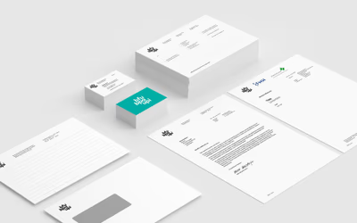
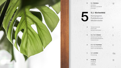
Templates for DIN formats are based on a uniform base grid with identical and coordinated units and proportions.
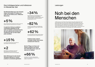
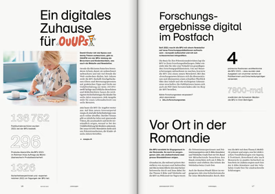
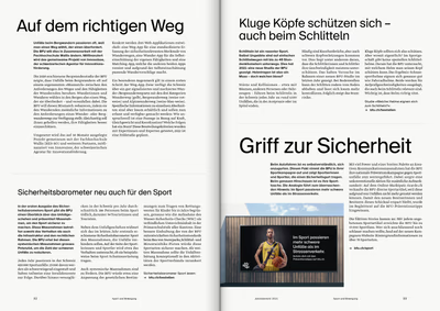
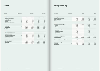
The visual world reflects the roles of the “researcher” and “advisor” and documents everyday situations in traffic, at home, during leisure, and in sports from an observer’s perspective.
Visual World


The visual world follows a zoom principle – from the overall view to the detail. It spans from the analytical bird’s-eye perspective of research to the focused advisory level. This concept is consistently applied across all communication channels.

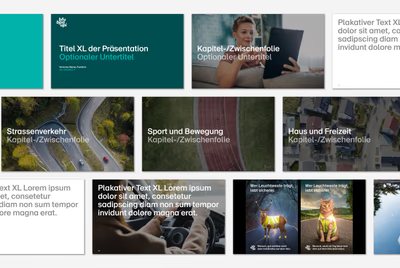
BFU becomes visually tangible and perceptible in live communication. Without being intrusive, the brand is unmistakably present and recognizable through uniform and carefully selected elements.



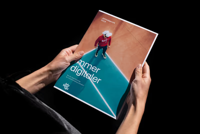
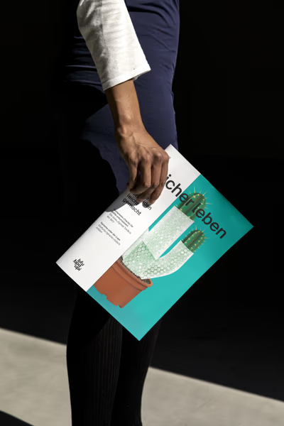
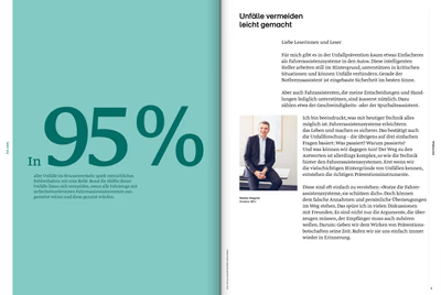
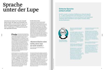
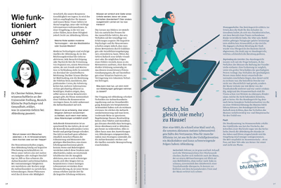
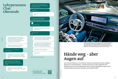
The magazine is published three times a year and is dedicated to a specific topic each time. Noord manages the entire visual appearance – from art direction through layout and design to final implementation.

As Switzerland’s competence centre for accident prevention, BFU is committed to safety nationwide. In addition to formally simplifying the logo to a version valid for all national languages, BFU conveys the cohesion of the language regions.
In the new logo, the three names are united nationally, across languages, and collectively. Aligned with the position of the language regions on the Swiss map, the three names are arranged slightly offset above one another. Like a seal of quality, they make BFU recognizable as a memorable wordmark.