SRF Meteo
From weather report to experience
Year
October 2021
Industry
Public / NPO
Initial Situation
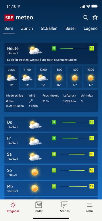
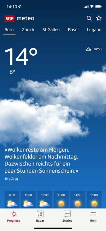
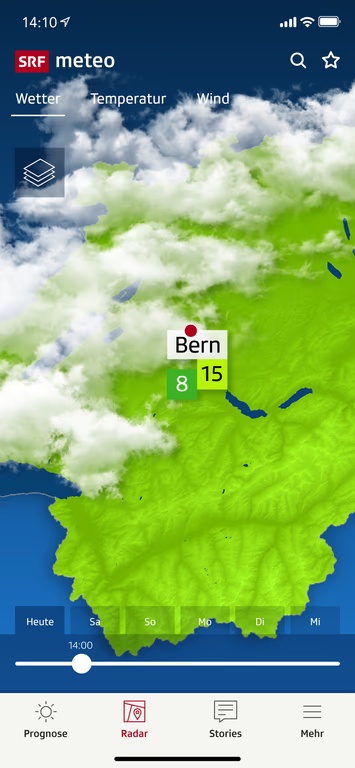
The focus of the project was the analysis of the existing SRF Meteo weather app to identify its strengths and weaknesses and gain a better understanding of its functionality and user impact.
Services
Links
How can weather be experienced, not just displayed – authentically, familiarly, and clearly?
The challenge was to conduct an in-depth analysis of the existing app and develop an approach that digitally captures the charm and approachability of SRF Meteo.
Comprehensive research on weather apps provided valuable insights into competitors and optimization potential.
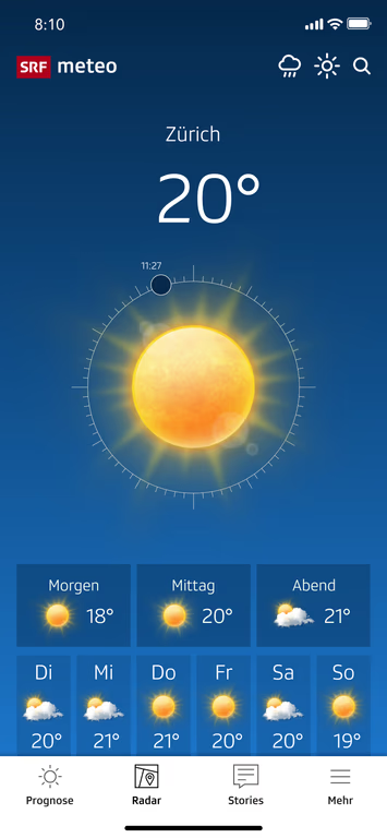
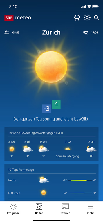
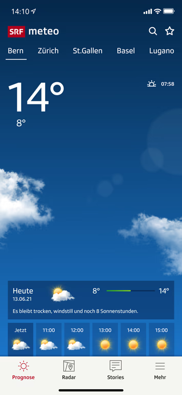
The icons were specifically optimized to represent the weather as realistically as possible rather than graphically or illustratively. This creates a stronger connection to the actual weather, enhancing credibility.
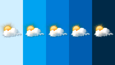
How realistic do weather icons need to be?
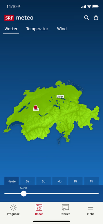
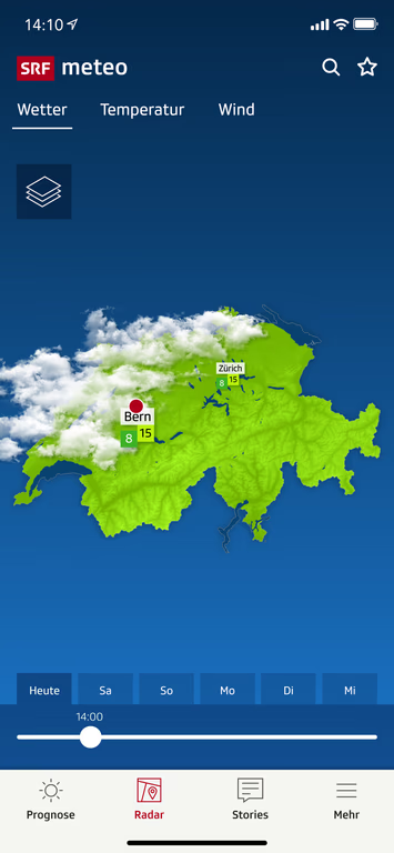
After analyzing maps, colors, guidelines, and texts, the focus was on optimizing the visual impact for an authentic and clear representation.
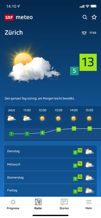
Colors play a central role in making weather and temperatures visually experiential. Warm, bright tones convey summer heat, while cool, muted shades make winter cold tangible.


Every color choice affects how users perceive the weather. The goal of the color palette analysis was to create an authentic and intuitive temperature perception – informative but also emotionally engaging.
From color schemes and symbols to maps and typographic layers – every detail was analyzed to understand its contribution to authentic and approachable weather representation. This served as a solid foundation to make the app more experiential.
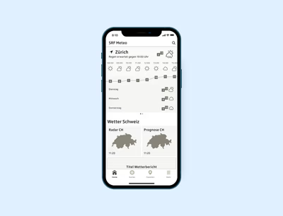
Based on the wireframe, design and functional approaches were developed to optimize usability and the SRF Meteo charm.
They were used to test visual and functional possibilities.
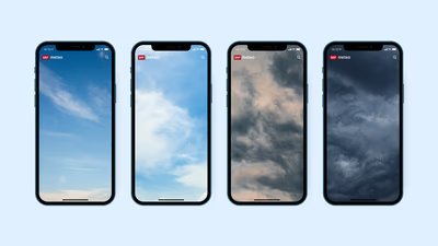
An intuitive and credible weather app must be functionally convincing while also appealing emotionally.
