EnergieSchweiz
The future is renewable
Year
July 2022
Industry
Public / NPO, Energy / Tech / Industry

Background
EnergieSchweiz, the program of the Swiss Federal Office of Energy to promote renewable energies and energy efficiency, is committed to a sustainable energy future. To reflect this mission visually, Noord redesigned the brand identity.
The new corporate design parameters are clear, consistent, and minimal – perfectly conveying EnergieSchweiz’s brand values: neutrality, trust, professionalism, and relevance. As part of the rebranding, the logo, color palette, visual language, and icons were revised. Noord also developed templates for brochures and office applications to further strengthen and standardize EnergieSchweiz’s communication.
Services
Links

Energy is often associated with warmth – a concept reflected in the brand symbol.
Custom icon set to strengthen the visual identity of EnergieSchweiz.
The warm orange gradient of the brand symbol emphasizes the association with warmth and energy, giving it an inviting radiance that conveys dynamism, positivity, and sustainability.


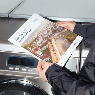
The visual world shapes a coherent brand identity by seamlessly blending custom-produced images with carefully selected stock material.

The comprehensive online guidelines consolidate all design principles in one central location – from logo variations and color palettes to typography and visual language. They provide a clear, unified foundation for visual communication and ensure a consistent brand presence.